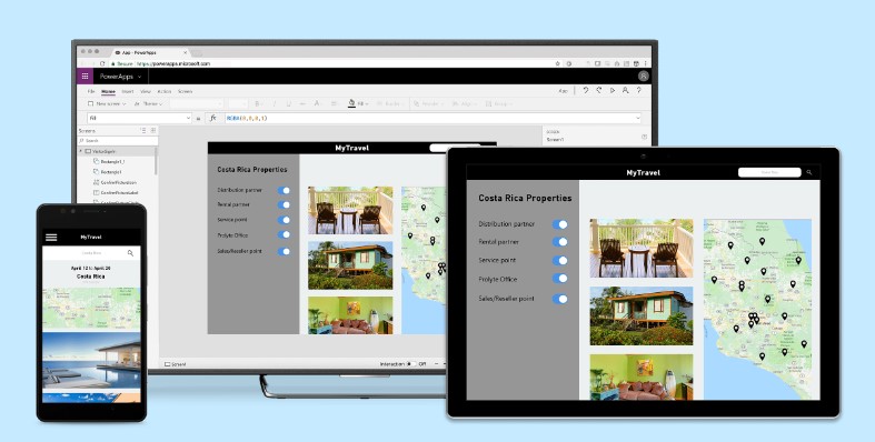
Canvas Apps can be accessed from many different devices such as phones, tablets, laptops, and desktops. A responsive canvas app automatically changes its layout depending on the screen size of the device
This can include simply stretching or re-sizing the screen. Alternatively it can involve changing the layout or position of individual controls to make an app truly responsive
Scaling an App to Fit the Screen
When creating a canvas app, you specify whether the app is for a phone or a tablet. This choice determines the size and shape of the canvas on which the app is built
In the app’s settings, if you have selected the tablet option, you can choose portrait or landscape orientation and screen size. You can also lock or unlock the aspect ratio and choose whether to allow device rotation
Those choices underly every other choice as you design screen layouts. If your app is run on a device of a different size, your entire layout scales to fit the screen. All the standard canvas app screen templates work this way
Whilst having a screen that scales fits the size of the screen on which it is being viewed is useful, if an app designed for a phone, is viewed on a desktop, the app scales but looks oversized for its space. Just by simply re-sizing, an app can’t take advantage of the additional pixels by showing more controls or more content. Equally an app designed for a laptop can be viewed on a mobile phone, but the definition is such that it probably can’t be used effectively
To check how an app will re-size on different screens, in Power Studio, select play or press F5 to view the app and change the size of the browser window. You will see the app expand and contract to fit the screen
App & Screen Dimentions
For a particular screen, the default formulas for an app’s width and height appear on the Advanced tab of the right-hand pane
Max(App.Height, App.MinScreenHeight)
Max(App.Width, App.MinScreenWidth
Where the MinScreenHeight and MinScreenWidth are defined in the Advanced tab for the app. The default values depend on whether you specified the app format to be tablet or phone when it was created
The app’s Width and Height properties correspond to the dimensions of the device or browser window in which the app is running. If the user increases the size of the browser window, the formulas in the screen’s Width and Height properties are re-evaluated and increase the size of the app to the available window size
The MinScreenHeight and MinScreenWidth properties are the minimum dimensions for the app. The above formulas ensure that the Width and Height can’t be smaller than the minimums
If the user decreases the size of the browser window or views the app on a smaller form factor than defined in the MinScreenHeight and MinScreenWidth properties, the user must scroll to view the content
Creating a Responsive Canvas App
With a responsive layout, the locations of controls on a screen can respond to different devices or window sizes. This can be applied to make the user experience feel more natural
Responsiveness needs to be built-in to the design of the app from the very start. It is far more complex to convert an app to be responsive after it has been built
Designing the Screens
Before you start developing your app, ask yourself some questions:
- What form factors or devices do you want to support?
- What elements of the app need to adapt depending on the form factor?
- What is the minimum app height and width that I want to support?
- Should non-essential controls be hidden on smaller form factors to improve usability?
Remember that a separate design for each form factor may be required for each page of the app so consider each screen individually
Creating a Responsive Design
Before you start making an app responsive, go to Settings > Display and disable Scale to fit, Lock aspect ratio, and Lock orientation
With a responsive design, the location and size of each control is defined using formulas instead of using fixed pixel values. These formulas typically use the Parent operator
In the simplest case, for example to make a rectangle icon fill an entire screen, place the control on the screen and set the control’s properties to these values:
| Property | Value |
| X | 0 |
| Y | 0 |
| Width | Parent.Width |
| Height | Parent.Height |
Because the control’s parent is the screen, Parent.Width and Parent.Height refer to the size of the screen, which in turn depends on the size of the window, or form factor on which the app is being viewed
As you construct screens that contain more controls, it isn’t practical to define the position and size of every control to the screen
Instead, by organizing controls into a hierarchical structure using containers, you can make your formulas easier to write and maintain. This way the screen can be broken down into subsections
Containers are the building blocks of responsive design. They should have their own responsive properties and settings to specify how they are positioned or resized on different screen sizes
Adapting for Device Size & Orientation
You can adapt the screen’s Width and Height properties to depend on the device orientation by changing the default formulas for an app’s width and height to those below
Max(App.Width, If(App.Width < App.Height, App.DesignWidth, App.DesignHeight))
Max(App.Height, If(App.Width < App.Height, App.DesignHeight, App.DesignWidth))
These formulas swap the app’s DesignWidth and DesignHeight values, based on whether the device’s width is less than its height (portrait orientation) or more than its height (landscape orientation)
You can also use the app’s Orientation property to dynamically determine whether the screen is being viewed in portrait or landscape mode. It will be return ‘vertical’ or ‘horizontal’ accordingly
If a control’s parent is the screen, the orientation can be identified using the formula below
App.Orientation
However, if the control is located inside a container, the container is the parent and not the screen. Because the container doesn’t have an Orientation property, the formula below should be used instead
App.ActiveScreen.Orientation
Once you determine the orientation on which the device is being viewed, you may want to rearrange controls within your screen to better use the available space. For example, if each of two containers occupy half of the screen, you might stack them vertically in portrait but arrange them side by side in landscape, as below
Screen Sizes & Breakpoints
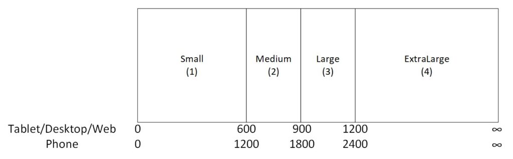
The screen layout can be adjusted based on the size of the device. The ScreenSize property classifies the current device size with a positive integer. The ScreenSize type provides named constants to help with readability. This table lists the constants:
| Constant | Value | Typical device type (using default app settings) |
| ScreenSize.Small | 1 | Phone |
| ScreenSize.Medium | 2 | Tablet, held vertically |
| ScreenSize.Large | 3 | Tablet, held horizontally |
| ScreenSize.ExtraLarge | 4 | Desktop computer |
These sizes can be used to make decisions about your app’s layout. For example, to hide a control on a phone-sized device but make it visible otherwise, use the ScreenSize type to define the control’s Visible property
Additionally, if you want a control to occupy a different area of the screen based on the screen size, set the control’s X & Y properties based on the ScreenSize. The formulas below are for the X and Y properties of 2 controls so that they display vertically for a phone but horizontally for all other form factors
Control A is always located at the same position irrespective of the form factor
Control A X Property: 0
Control A Y Property : 0
Control B has its X position defined by the screen on which the app is being viewed
Control B X Property: If(ScreenSize = 1, 0, App.Width/2)
Control B Y Property: If(ScreenSize = 1, App.Width/2, 0)
The screen’s Size property is calculated by comparing the screen’s Width property to the values in the app’s SizeBreakpoints property
In an app created for tablet or web, the default value in the app’s SizeBreakpoints property are 600, 900 & 1200 pixels. In an app created for phones, the value is 1200, 1800 & 2400
An app’s breakpoints can be customized by changing the values in the app’s SizeBreakpoints property
As many additional breakpoints as you require can be added
Summary
Making an app responsive can significantly improve the usability of the app. However, before you invest the time required to make an app fully responsive, check the devices on which it will be used
Doing some up front design on how you want the app to look on each form factor, and in portrait or landscape mode will definitely speed up the development
Bear in mind that to test responsive behavior, you must save and publish your app. It can then be opened on different devices or in browser windows of various sizes and orientations to see how it looks
Finally, don’t drag a control with dynamic position or size values to a different location or resize the control by dragging its border as this will overwrite those expressions or formulas. Instead, make any entries directly in the properties