SVGs can be used dynamically in Power Apps such as to change their color or to create animation. This article explains a couple of examples of how using dynamic SVGs in Power Apps can be very helpful to users. The first example uses SVGs to create a really nice progress info-graphic. The second example animates an SVG to draw attention to specific text. Both are pretty simple to create and because the content is created by the Power App browser, there is no delay as there may be in loading an image
Dynamic SVGs
Visual Progress Indicator
A picture speaks a thosand words and a visual progress indicator is a great way to summarise status. This visual can represent the completeness of a form, the status of an order or in this case the current phase of a project. The source of the data behind the visual can be generated from the Power App itself or taken from a data source such as SharePoint. In this case the data source is intented to be Microsoft Project Online
To demo how the graphic works I’ve hooked it up to a Slider control
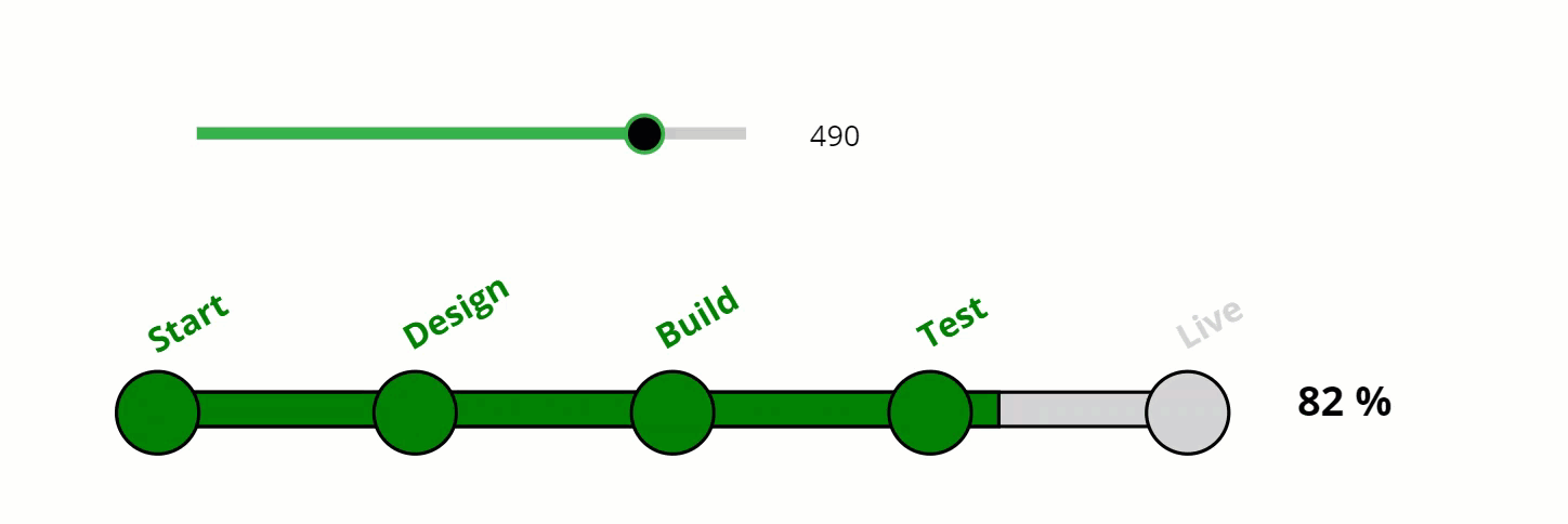
SVGs are created within a Power Apps Image control. Below is the code deployed within the Image property of the control. Lines 1, 2, 10 & 11 specify the contents as being SVGs within the defined Viewbox. Lines 3 – 9 create the SVGs which are 2 rectangles and 5 circles
1
2
3
4
5
6
7
8
9
10
11
"data:image/svg+xml;utf8, " & EncodeUrl("
<svg viewBox='0 0 800 60' xmlns='http://www.w3.org/2000/svg'>
  <rect x='50' y='20' width='600' height='20' style='fill:lightgrey;stroke:black;stroke-width:2' />
  <rect x='50' y='20' width='" & Slider1.Value & "' height='20' style='fill:green;stroke:black;stroke-width:2' />
  <circle cx='50'  cy='32' r='24' stroke='black' stroke-width='2' fill='" & If(Slider1.Value>12,"Green","lightgrey") & "' />
  <circle cx='200' cy='32' r='24' stroke='black' stroke-width='2' fill='" & If(Slider1.Value>162,"Green","lightgrey") & "' />
  <circle cx='350' cy='32' r='24' stroke='black' stroke-width='2' fill='" & If(Slider1.Value>312,"Green","lightgrey") & "' />
  <circle cx='500' cy='32' r='24' stroke='black' stroke-width='2' fill='" & If(Slider1.Value>462,"Green","lightgrey") & "' />
  <circle cx='650' cy='32' r='24' stroke='black' stroke-width='2' fill='" & If(Slider1.Value>590,"Green","lightgrey") & "' />
</svg>"
)
Line 3 creates a solid lightgrey SVG rectangle. Line 4 creates a green SVG rectangle that has a width determined by the slider varying from zero to 600. The SVG created by line 4 overlays the SVG on line 3 so giving the impression of a single rectangle changing color
The 5 SVG circles created by lines 5 to 9 overlay the rectangles. All are identical except for their cx value defining where each of the circles are located on the X axis of the rectangles and at what point their color value changes from lightgrey to green
Other attributes of the overall info-graphic are a percentage value to the right of the graphic which is calculated from the slider. Also the slanted text defining the milestones is created by a HTML text input box. The code is below for the first milestone. The CSS Transform attribute rotates the text to the desired angle
"<p style='margin:0;font-size:20px;font-weight:bold;color:" & Label2.Text & ";
transform: rotate(-30deg);position: relative;'>
Start
</p>
"
And that’s it. Not complex at all to create a great looking progress indicator. The graphic is made up of 7 seperate SVGs. It is possible to merge these in to a single SVG and hence make the change of color even more straightforward. However, due the more inticate shape of the single SVG, the code to create the SVG would be much more complex
Attention Grabber Graphic
Now lets create a simple attention grabber SVG that is not only animated but also changes its vertical position depending on which item of text is selected

Here’s the code for the Image control that contains the SVG:
1
2
3
4
5
6
7
"data:image/svg+xml;utf8, " & EncodeUrl("
<svg viewBox='0 0 60 30' xmlns='http://www.w3.org/2000/svg'>
  <polygon points='' style='fill:red;stroke:black;stroke-width:1'>
  <animate attributeName='points' dur='1s' from='0,0, 30,15, 0,30' to='30,0, 60,15, 30,30' repeatCount='indefinite'/>
  </polygon>
</svg>"
)
Lines 1, 2, 6 & 7 are very similar to the equivalent lines in the first example. They specify the SVG and the size of the Viewbox. Line 3 defines the SVG shape, color and border. Line 4 specifies the size and dimensions of the SVG and through the animate attribute, defines how the shape changes, the duration of the animation and the number of times the animation runs (it runs indefinately in this example)
The vertical position of the SVG is defined by assigning the Y property of the Image control to a variable. When a menu item is selected, the variable is changed to the same value of the Y property of the of the item selected
Summary
There are an infinate number of SVG shapes that can be created and an infinate number of ways they can be animated!
The specifc CSS code does vary quite a bit depending of the SVG shape and how it is animated, but there are some helpful reference sites. w3schools.com is a great place to start. Also see my earlier introductary post on SVGs here SVG in Power Apps