Components
Components are reusable building blocks for canvas apps allowing app makers to create custom controls to use inside an app, or across multiple apps. Components are a fantastic way to re-use functionality either that you’ve created yourself or to benefit from the work of others
Components & Custom Functions
Benefits of using Components
In my apps I generally use Components in one of 3 ways:
Firstly, to standardise and re-use functionality either within a single app or across multiple apps. A great example of this is an organisation that requires standard branding and a consistent format for its Power Apps menus. A menu created as a Component only has to be created once and can be used many times
Secondly, Components are a great way to re-use functionality that others have created and made available for others to use. There are many Components freely available via the Microsoft Power Apps Community on the link below. The advantage of using these Components is that you’d don’t need to understand exactly how each Component works to use them in your own Apps. All that’s required is to supply the necessary Inputs to these Components they’ll work just fine – think of them as a ‘plugin’ or a ‘black box’ that provides the Output you require. Checkout the Components available, many provide great visuals to use in your apps
https://powerusers.microsoft.com/t5/Canvas-Apps-Components-Samples/bd-p/ComponentsGallery
Finally, if you need custom functions or formulas within your apps that aren’t available with Power Apps out of the box, you can create a Component so you don’t need to keep recreating or remembering the formula. For simple formulas this might not be an issue but if you need something way more complex, for example the validation of a credit card number or an international bank account number, a Component is definitely the way to go. Using a Component also has the advantage that if the formula changes or if a new block of numbers is to be used, the calculation only has to be updated once in the Component and not across multiple formulas and multiple apps
Components and Custom Functions
We are going to create a simple Component that acts as a custom function to calculate the area of a circle from the radius. Not a complex formula but a good way to demo how to create a custom function using a Component and how to get started with using Components
First of all, in a blank canvas app go to the controls Tree view in the left pane, click on the Components tab and create a new Component. Rename it funcCircleArea
Change the Fill property of the funcCircleArea Component to gray so we will be able to differentiate it from other controls when we embed it in our App
On the right-hand Component pane, add a Custom Input Property to the Component with the Display Name RadiusValue and the description ‘Length of circle radius’. Leave the Property Type as Input and set the Data Type to Number. Click Create
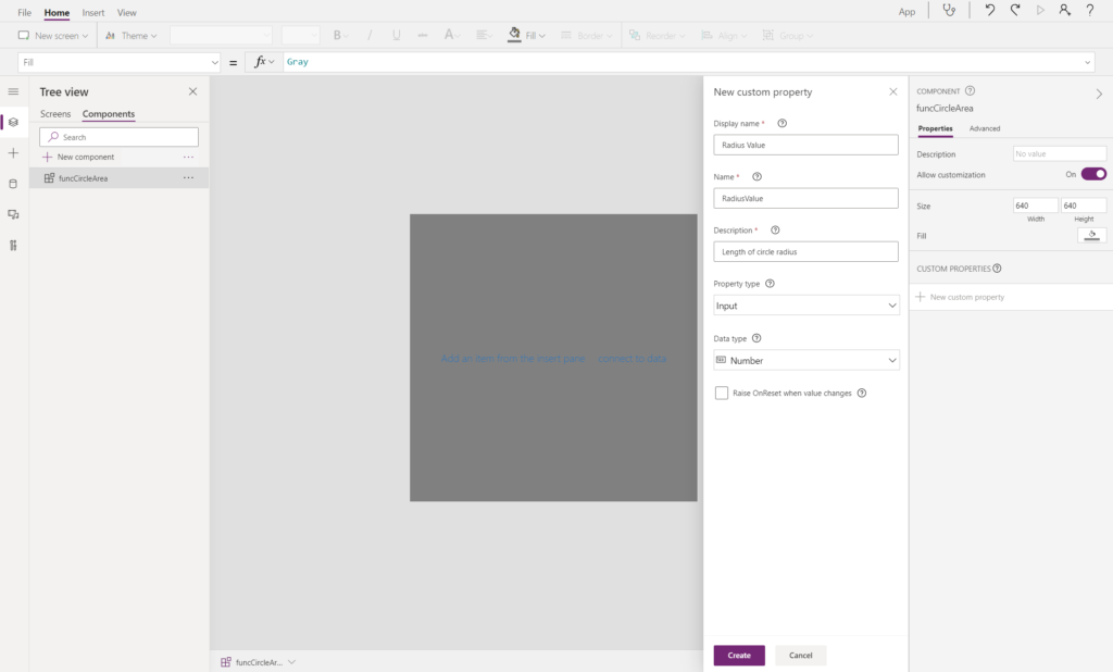
Now add a custom Output to the Component called AreaValue and the description ‘Area of the circle’. Change the Property Type to Output and set the Data Type to Number. Click Create
Click on the Component and select the RadiusValue input property you have just created and set the value to InputRadius. You’ll get an error flag but we’ll fix that in a minute
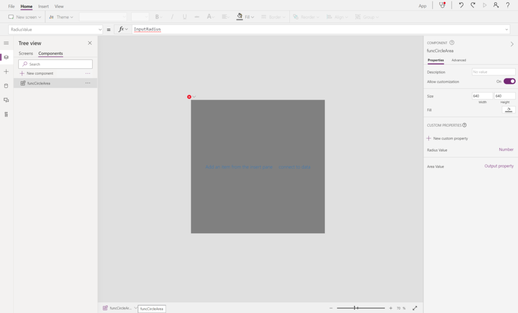
Select the AreaValue output property of the Component you have also just created and set the value to the formula for the calculation of the area of a circle: Pi()*(funcCircleArea.RadiusValue .Radius_Value^2)
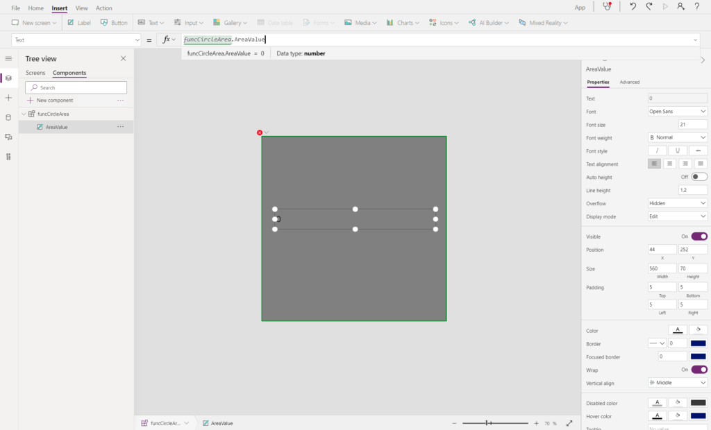
Now insert a label in the funcCircleArea Component and call the label: AreaValue. Set the Text property value: funcCircleArea.AreaValue
Go back to the Screens tab under Tree view and using the Custom menu, add the Component funcCircleArea to the App and resize as appropriate
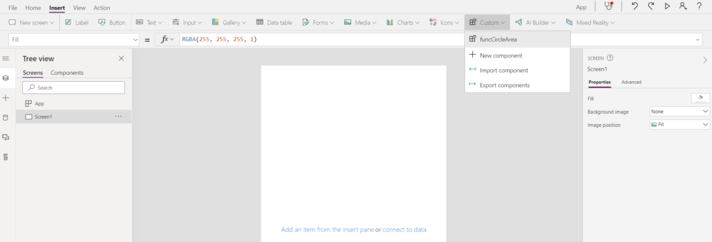
Note the instance of the Component in the App is given a slightly different name to the original Component. This is because a Component can be reused multiple times and each instance of the Component is given a unique name. In this case the name of the Component is funcCircleArea_1
Insert a Text Input field and change its name to InputRadius – the error created earlier is now fixed as the Input to the Component has a source. Remove the Default text and assign the HintText to ‘Radius’. Also change the Format property to Number
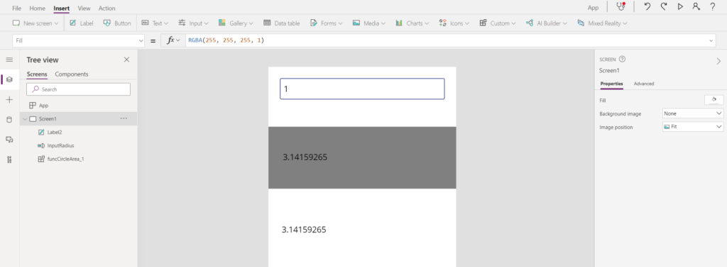
Run the app and enter a Value into the InputRadius box and see the result. Entering a value of 1 in the Radius Text Input box give the value of 3.14159265 ie Pi
Now that’s great and we have our custom function. The problem is that the output is just displayed on screen and we need to get the value out of the Component so we can use it in our App
Here’s how to do that… Create a label on the screen (outside of the funcCircleArea_1 Component) and assign the Text property to funcCircleArea_1.AreaValue
Run the app again and after entering a value into the Radius Input Box you’ll see the result in both the Component itself and the newly created label
In order for the Output to be displayed in the App outside the Component, the Component itself has to be inserted on the App screen, however, set the Visible property of the Component to be false so the Component can’t be seen
You can use the function funcCircleArea_1.AreaValue to carry the output from the Component or assign the value to a variable so you can use it throughout your app
That’s how straightforward it is to create custom functions with only the minor inconvenience of having to insert and hide a Component on your screen