Power Apps has a load of functionality you can use in your apps, but some of the real workhorse controls used in the majority of apps are the humble, Input Boxes and Galleries
In this post I’ll cover some of the essentials of using these controls together with Collections and Variables
I’ll create a simple app to capture names, add them to a collection, view them in a gallery and provide the capability to edit or delete existing records
Input Boxes, Galleries & Collections
Creating a Collection, Displaying in a Gallery & Editing Records
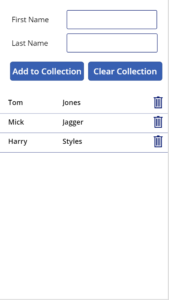
First of all on a blank app, insert a couple of Text Input boxes to capture the first and last names together with matching Labels. Make the Default property for these two Input Boxes blank
Now insert a couple of Buttons to start to build the app screen you can see on the right
The first Button I’ve called ‘Add to Collection’ and as you’d anticipate, this button will add the data entered in the two Text Input boxes to a Collection called colName. Once this is done, the existing entries in the two Text Input boxes will be Reset so their content is emptied ready for the next name to be entered
The second Button labeled ‘Clear Collection’ will completely empty the colName collection and also Reset the two Text Input boxes
The OnSelect property for the ‘Add to Collection’ Button should be set to:
Collect(colName,{First_Name:Input_First_Name.Text,Last_Name:Input_Last_Name.Text});
Reset(Input_First_Name);
Reset(Input_Last_Name);
The OnSelect property for the ‘Clear Collection’ Button should be set to:
Clear(colName);
Reset(Input_First_Name);
Reset(Input_Last_Name);
Now we add a Gallery to display the records. The Items property should be set to be our Collection colName with the Gallery displaying both the fields in the collection: First_Name and Last_Name
Add a ‘delete’ or ‘bin’ Icon to the Gallery, making sure the Icon is actually inside the Gallery and not elsewhere on the screen. We’ll use this Icon so that the individual records can be deleted from within the Gallery. Make the OnSelect property for the Icon the following:
Remove(colName,ThisItem)
Now lets add some data! Run the app and use the Text Input boxes to add several names and see them displayed in the gallery. Check you can use the Icon to delete individual records from within the Gallery before moving on
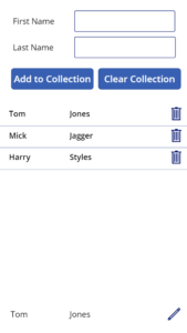
Editing the Records in the Collection
Ultimately we’ll be editing the records directly in the Gallery but for the time being we’ll edit them in two new Text Input boxes to demo the DisplayMode property
Add a couple of Text Input boxes called Edit_First_Name and Edit_Last_Name and set their Default properties to the following:
Gallery.Selected.First_Name
Gallery.Selected.Second_Name
Run the app again and select different records in the Gallery and see them displayed in the two boxes – similar to the image opposite
We will shortly be using these boxes to edit the records in the Collection
Add an Edit Icon and use it to set the value of a Boolean context variable (in this case I’ve called a Boolean variable called conEdit) to toggle between ‘true’ and ‘false’ by setting the OnSelect property of the edit icon to:
UpdateContext({conEdit:!conEdit})Set the Visible property of the Edit Icon to the following so the Icon is only displayed when the value of conEdit is set to ‘false’
!conEdit
Now insert a Save Icon directly on top of the Edit Icon and also use it to set the value of the same Boolean context variable to toggle between ‘true’ and ‘false’ by also setting the OnSelect property of this Icon to:
UpdateContext({conEdit:!conEdit})Set the Visible property of the Edit Icon to the following so the Icon is only displayed when the value of conEdit is set to ‘true’
conEdit Now we have the Edit Icon visible only when the varEdit variable is ‘false’ and the Save Icon only visible when varEdit is ‘true’. When toggling Boolean variables it’s always useful when testing the app to put a label on screen so you can check what the variable value is set to at any one time
Run the app again and click on which ever Icon is displayed and it will switch between the Edit and Save Icons as the conEdit variable toggles between ‘true’ and ‘false’
Now we’ll make the two Text Input boxes editable when the edit Icon is selected
Select the DisplayMode property of the boxes in turn and set it to the following
If(conEdit,DisplayMode.Edit,DisplayMode.View)
This could be written as: If(conEdit=true,DisplayMode.Edit,DisplayMode.View) which makes it easier to understand, but there’s no need to include the ‘=true‘ so it can be left out
We now have the context variable conEdit directing four controls: the Visibility of the edit and save Icons and the DisplayMode property of the two Text Input boxes
Now we add the following Patch function to the OnSelect property of the Save Icon so that the changes made in the Text Input boxes are updated in the colName collection. Don’t overwrite the existing content for the OnSelect property just add the new line above
Patch(colName,Gallery.Selected,{First_Name:Edit_First_Name.Text, Last_Name:Edit_Last_Name.Text});Run the app and select any record in the Gallery and you can see the record displayed in the two Labels
Initially they are not editable because View is the default DisplayMode because the default value for Boolean variables is always set to ‘false’ when an app is fisrt run. However, clicking on the Edit Icon changes the conEdit variable to ‘true’ which as we know makes the two labels editable by changing the DisplayMode to Edit. The Edit Icon disappears as it’s Visible property is changed to ‘false’ and it is replaced by the Save Icon
Making changes to the names in the two Labels and clicking the Save Icon updates the record in the colName variable. The change is then immediately displayed in the Gallery. Clicking the Save Icon also changes the conEdit variable value to ‘false’. The cause the DisplayMode of the two Text Input boxes to change to View together with the Save Icon being replaced by the Edit Icon
Summary
In this post we’ve covered some of the essentials of using Text Input boxes and Gallery controls together with Collections and Variables to create a basic app
We’ve used the app to capture data and add it to a Collection, view the Collection’s records in a gallery and provide the capability to edit or delete those records
In the next post I’ll makes the app more user friendly by allowing editing of content directly in the Gallery itself rather than using a seperate label
Further Reading
- Hiredgun.tech: Updating Records from within a Gallery
- Hiredgun.tech: Filter Galleries – 3 Great Tips and Tricks
- Hiredgun.tech: Select Multiple Records in a Gallery
- Power Apps Reference: Patch
- Power Apps Reference: Galleries