A Power Apps expanding Gallery is a fantastic way to allow users to drill down to a greater level of detail without overloading their screens. They can also be used as a menu for navigation. The key is to use not one Gallery but two and doing this, I will build a expanding Gallery that can be used and adapted for many situations
I’ll be using a couple of Power Apps techniques. Firstly nested Galleries, whereby a child Gallery is inserted within a parent Gallery. Secondly I’ll use the GroupBy function. GroupBy is a useful and flexible way to manipulate both a table structure and the data the table contains by grouping identical data in the same column together. GroupBy can also be used to facilitate the creation of sub totals and other calculations within the table
Power Apps Expanding Gallery
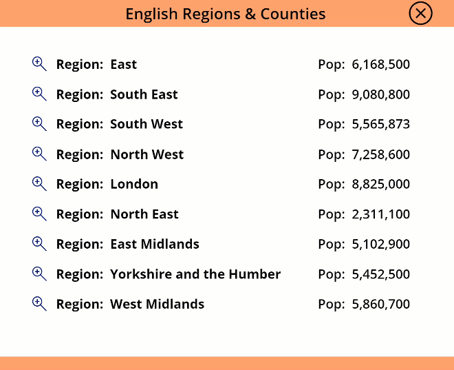
Above is both the App I’ll be creating and a sample of the data on English Counties and their Regions that I’ll be using as the data source
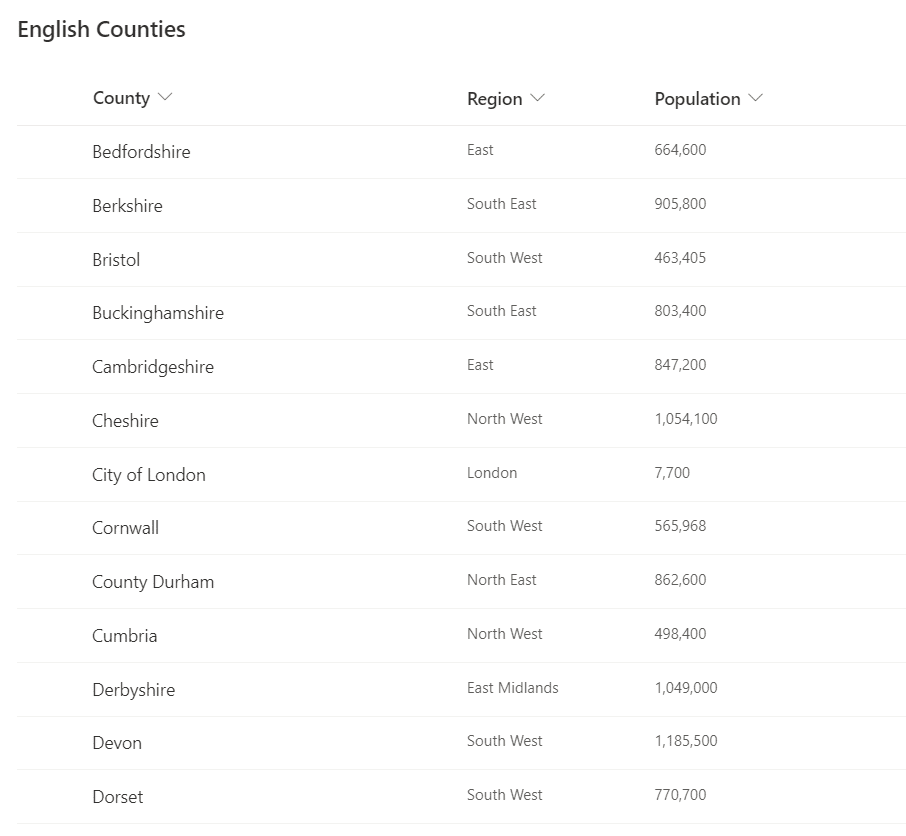
My data is hosted in a SharePoint List and contains the 48 English counties, their populations and the 9 English regions to which they belong. I’ll build the App so when it loads, the default view will show the 9 English regions together with their aggregated population
Clicking on a ‘Zoom In’ Icon for a Region will expand the view to dynamically display the individual counties within that Region together with their populations. Clicking on a ‘Zoom Out’ Icon or the ‘Zoom In’ Icon of another Region automatically collapses the existing view and opens the new Region’s list of Counties
Nested Galleries
The automatic resizing of the Galleries is made possible by the use of a flexible height Gallery for the parent and a fixed height Gallery for the child. The height of the child Gallery will be defined by the number of records and specified in the Height property. This means the size of the child Gallery will change depending on the number of Counties each Region contains. The parent Gallery, being of flexible height, will then automatically expand and contract depending on the number of records contained in the child Gallery
Building the App
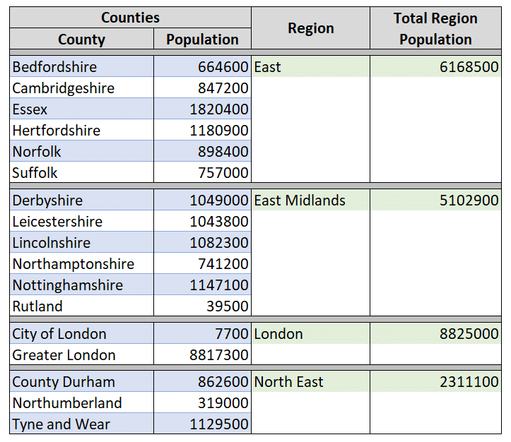
Connect to the data source and add a blank flexible height Gallery. This will be the parent Gallery and we first set the Items property to specify the records to be displayed. I will use the GroupBy function to group all the data in my SharePoint List by the Region column. The Sum function will then total all the individual County populations to calculate a total regional population. The output of the Sum function is then added to the table by the AddColumns function. Combining these functions into a single formula, set the Items property of the Gallery to:
AddColumns(
     GroupBy(
          'English Counties',
          "Region",
          "Counties"
     ),
     "Total Region Population",
     Sum(
          Counties,
          Population
     )
)
A visualisation of the output of the above formula is shown opposite
It’s important to understand that his formula creates a table that exists purely within the parent Gallery
The data in the table can be accessed from anywhere in the parent Gallery, including any child Galleries that we wish to create
Now the table has been redefined into the required format we add a couple of Labels to the parent Gallery
The first Label will display the Region
"Region: " & ThisItem.Region
The second Label is to display the overall population for the Region. I’ve specified comma formatting
"Pop: " & Text( ThisItem.'Total Region Population', "[$-en-GB]#,###" )
Next we need to display the individual Counties and their populations for each Region. As there are multiple Counties for each Region this can’t be done with a Label so embed a fixed height child Gallery within the parent Gallery. I’ve called my child Gallery galChild. It can be a little tricky to insert the child Gallery in the first record of the Parent Gallery. I find setting the parent Gallery to be a little wider than the child Gallery makes this easier
We need to filter the child Gallery by the Region selected within the Parent Gallery so only applicable Counties are displayed. To do this, set the Items property of the child Gallery to the following:
Filter('English Counties',Region=ThisItem.Region)
Now add a couple of Labels to the child Gallery to display the County and the Population:
ThisItem.County
ThisItem.Population
Defining the Child Gallery Height
The Height property of the child Gallery needs to be defined by the number of records it contains. In the formula below I’ve used 50 pixels per record, but adjust as appropriate for your needs:
CountRows(galChild.AllItems)*50
It’s likely that you’ll need to tweak the position of the child Gallery, it’s size, the position and alignment of of its Labels so that they align appropriately with the Labels of the parent Gallery
You’ll find that the spacing of the Gallery content can look quite different in ‘Preview Mode’ so ensure you use Preview when checking the alignment of controls, don’t rely on the Power Apps studio view
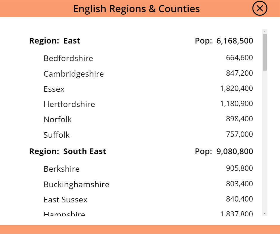
Once aligned, you can see opposite that the is App starting to take shape
Adding an Icon to Expand and Collapse Views
At the moment, all the child County records are fully expanded for all Regions and can be viewed using the scroll bar. We could use this format but I require just the selected Region to display its child Counties. To enable this, add an Icon that will be used to expand and collapse the child Gallery. The Icon should be inserted within the parent Gallery. I’ll use the magnifying glass Icons to denote expanding and collapsing the child Gallery and place the Icon to the left of the Region Label.
We need to use a variable to denote which Icon is displayed. By default I want the variable to be set to “false” so that no expanded menus are displayed and all Regions display the ‘Zoom In’ Icon. Use the OnSelect property of the Icon to define a Global Variable:
If a Region is selected, I want the Icon for that Region to change to ‘Zoom Out’. To do this, define the Icon to be displayed in terms of the gblViewRegion variable, via the Icon’s Icon property:
Finally, we use the gblViewRegion variable a third time to change the visibility of the child Gallery so that it is only visible when the respective Region is selected. To do this set the Visible property of the child Gallery to:
Launching the App, you can now see that by default, all views are collasped. Selecting a particular Region expands the view to display all of the Counties within that Region and their individual populations
Selecting another Region automatically collapses the existing Region view and displays the Counties for the new Region
Alternatively, click on the ‘Zoom Out’ Icon to collapse the expanded view and return to the default format
And there we have it. The App is complete
More Possibilities
Only one Gallery can be nested within another so the expanding Gallery has a maximum of 2 nodes, the child and the parent. However, the App could be configured so that selecting a record in the child Gallery displays a further level of detail (such as the Counties physical area or the County Town) in a separate Gallery, Form, or Label. This makes the Power Apps expanding Gallery technique really flexible with the potential to use it as a sophisticated menu