When building a Canvas app screen, sometimes there’s not enough screen space for all the data you want to display. Possible solutions are to implement vertical or horizontal scrolling or add tabs to the screen, but a nice alternative can be to use Tooltips
If you have specific data that isn’t necessarily relevant for most users who are quickly scrolling a gallery, but other users who are interested in an item may find it useful, Tooltips can be a great solution
Tooltips
Tooltips are primarily intended to be added to buttons or icons, to indicate the action that will be taken when the user clicks, and are only visible when the user hovers over the control
However, they can also be used with non-interactive controls such as labels, images and most other controls to display additional information
There are a couple of neat Tooltip tricks to make them particularly useful
The first is that variables can be added into tooltips to make the content dynamic, so different information can be displayed depending on the content of the control. This means that data from Dataverse or any other data source can be displayed in a Tooltip
The second tip is that a new line can be created within the Tooltip by using the char(10) ASCII character to make the Tooltip more readable
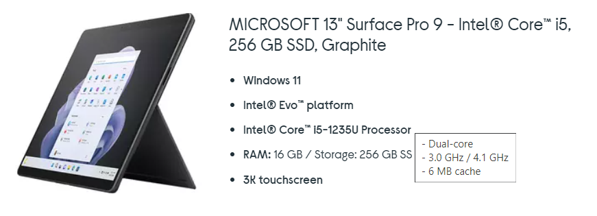
Below is a extract from a gallery of laptops available for order, showing a machine’s core specification. Hovering over each feature, in this case the processor, displays additional info such as the processor core type and frequency

The Tooltip is set using the code below with the values assigned via the gallery from a data source such as Dataverse
"
- " & ThisItem.Core & Char(10) & "
- " & ThisItem.Frequency & Char(10) & "
- " & ThisItem.Cache
The advantage of using Tooltips is that they don’t require the user to click on the control and they are immediately displayed on screen. They are also easy to implement. Just remember that for a Tooltip to be displayed it requires the user to hover over the control, so this won’t work on a mobile device or tablet when a mouse isn’t being used
If only we could add HTML to a Tooltip, that would be even more useful. However, as Microsoft have recently removed the capability to add HTML to the Notify function due to security concerns, this feature doesn’t appear likely to be added in the near future