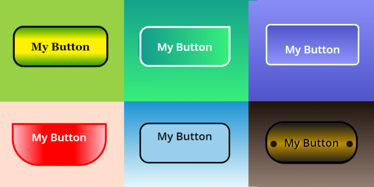
CSS makes websites look fantastic and it can do the same for Power Apps.  Using a HTML box and inline CSS you can create great looking gradients for both backgrounds and buttons and all render perfectly on handhelds and desktops

Beautiful Buttons with CSS

Beautiful Buttons with CSS

Using CSS in Power Apps

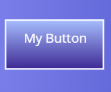
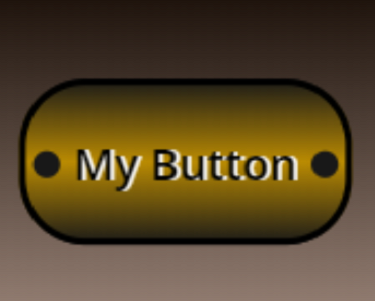
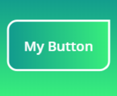
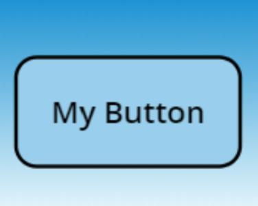
All the buttons and backgrounds above have been created on Power Apps and are fully functional.  Following the steps below we will generate CSS gradients in a HTML text box and create attractive buttons that you can use in your apps

The CSS used is essentially based on just the two lines below generating gradients and borders, so lets take it step by step

background: linear-gradient(direction, color1, color2, …);
border-radius: top-left top-right bottom-right bottom-left;

Step 1

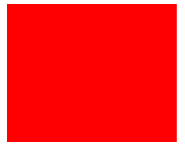
We can all create a red rectangle in Power Apps, a rectangular icon with red fill – right?  But you can also do exactly the same with a HTML text box and inline CSS

"<div style=""
height:139px;
background: Red;
""</div>"

Step 2

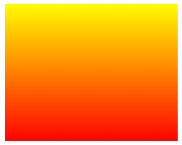
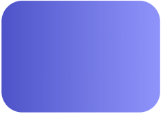
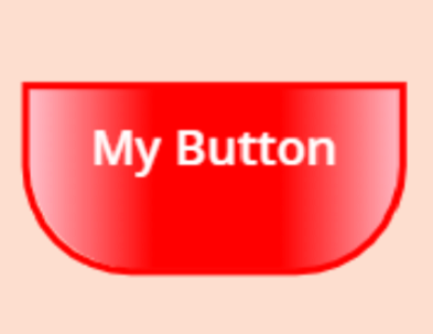
OK, thats interesting but it doesn’t give us anything new I hear you say!  However, we can change the background from ‘solid’ to ‘gradient’ by using the linear-gradient property of CSS.  By default the gradient flows from top to bottom

<div style=""
height:139px;
background: linear-gradient(" & "Yellow" & "," & "Red" & ");
""</div>"

Step 3

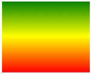
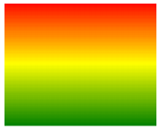
We can create even more complex gradients and add more colors.  There’s no limit to the colors you can add, though I recommend a maximum of 4 so it doesn’t look too psychedelic!

"<div style=""
height:139px;
background: linear-gradient(" & "Green" & "," & "Yellow" & "," & "Red" & ");
""</div>"

Step 4

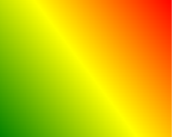
OK, this is starting to look interesting.  We can take this a stage further and flip the box by introducing the direction parameter.  Setting a value of zero degrees immediately turns the box the other way up

"<div style=""
height:139px;
background: linear-gradient(0deg," & "green" & "," & "yellow" & "," & "red" & ");
""</div>"

Or how about 45 degrees…

"<div style=""
height:139px;
background: linear-gradient(45deg," & "green" & "," & "yellow" & "," & "red" & ");
""</div>"

Step 5

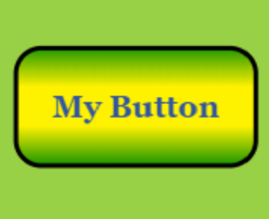
So far we’ve used just the base color palette but we aren’t limited to that.  Let’s change the color scheme completely and start using Hex colors with a 90 degree direction.   Its starting to look more ‘corporate’ and usable in every days Power Apps

"<div style=""
height:139px;
background: linear-gradient(90deg," & "#4e54c8" & "," & "#8f94fb" & ");
""</div>"

Lets introduce the border-radius capability to round the corners and start building toward a cool looking button

"<div style=""
height:139px;
background: linear-gradient(90deg," & "#4e54c8" & "," & "#8f94fb" & ");
border-radius: 30px 30px 30px 30px;
""</div>"

Step 6

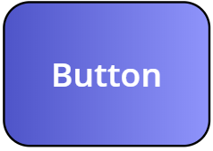
And finally we are going to overlay a button with a border and text.  The button needs to be ordered at the front above the HTML text to use the OnSelect property of the button and have a transparent fill so the HTML text box underneath containing the CSS is visible.  The button should be the same size and have the same border radius as the HTML text box so it overlays exactly

"<div style=""
height:161px;
background: linear-gradient(90deg," & "#4e54c8" &","&"#8f94fb" & ");
border-radius: 30px 30px, 30px, 30px;
""</div>"

All done!  HTML Text boxes have Height, Width, X & Y properties just like any other control so you can make them fully responsive.  You now have your new button that you can use just as you would any other, but with the added beauty of CSS!

HTML/CSS for the Featured Buttons

Button
"<div style=""
height:100px;""
background: linear-gradient(180deg," & "#a8c0ff" & "," & "#3f2b96" & ");
</div>"
Background
"<div style=""
background: linear-gradient(0deg," & "#4e54c8" &","&"#8f94fb" & ");
height:200px;""
</div>"

Button
height:100px;
background: linear-gradient(#181818" &","&"#BA8B02" &","&"#181818" & ");
border-radius: 40px 40px 40px 40px;""
Background
"<div style=""
background: linear-gradient(180deg, " & "#1e130c" &","&"#9a8478" & ");
height:200px;""
</div>"
Button
"<div style=""
height:100px;
background: linear-gradient(90deg," & "#11998e" &","&"#38ef7d" & ");
border-radius: 30px 0px, 30px, 30px;""
</div>"
Background
"<div style=""
background: linear-gradient(" & "#11998e" &","&"#38ef7d" & ");
height:200px;""
</div>"

Button
RGBA(153, 207, 236, 1)
Background
"<div style=""
background: linear-gradient(-180deg, " & "#1c92d2" &","&"#f2fcfe" & ");
height:200px;""
</div>"
Button
"<div style=""
height:100px;
background: linear-gradient(-180deg, " & "#1E9600" &","&"#FFF200" &","&"#FFF200" &","&"#1E9600" & ");
border-radius: 20px 20px, 20px, 20px;""
</div>"
Background
RGBA(152, 208, 70, 1)
Button
"<div style=""
height:100px;
background: linear-gradient(90deg, " & "Pink" &","&"Red" &","&"Red" &","&"Pink" & ");
border-radius: 0px 0px 60px 60px;""
</div>"
Background
RGBA(253, 222, 207, 1)

Additional Resources

Hiredgun.tech: Color Animated Buttons
Hiredgun.tech: Button Rotation Animation with CSS
Hiredgun.tech: Neon Effect Animated buttons with CSS

Also, checkout these sites for ideas on cool looking CSS gradients and to find out more about CSS and its background-gradient property:
https://cssgradient.io/
https://webgradients.com/
https://www.w3schools.com/cssref/func_linear-gradient.asp

3 thoughts on “Beautiful Buttons with CSS”

Leave a Comment

Your email address will not be published. Required fields are marked *

Scroll to Top