In the second post in this series using HTML text boxes and CSS to create animated Power Apps buttons, I’ll demo how to dynamically change the button color by adding a variable into the inline CSS

Animated Buttons
Start by inserting a HTML text box and adding the HTML & inline CSS below. For more detail on exactly how to do this please see the earlier post ‘Beautiful Buttons with CSS’
"<div style=""
height:199px;
border-radius: 30px, 30px, 30px, 30px;
background: linear-gradient(0deg," & "red" & "," & "RGB(255," & varGreen & ",0)" & "," & "red" & "," & "red" & "," & "red" & "," & "RGB(255," & varGreen & ",0)" & "," & "red" & ");
""</div>"
RGB(255,0,0) is Red and you can see the linear-gradient has 7 tiers. Tiers 1, 3, 4, 5 & 7 are all just straight Red. Tiers 2 & 6 contain the variable varGreen that transitions the value of the Green/G element to change the color of these two tiers
The next stage is to add a timer with the following properties and define the value of the varGreen variable
Set the timer Duration property to 50 (a 20th of a second)
Set the timer Repeat property to true
Add the following into the OnEnd property of the timer:
UpdateContext({varCounter:varCounter + 1});
UpdateContext({varGreen:Round((765+255*Sin(varCounter/10))/4,0)})
The Sin (Sine) formula calculates the radian equivalent of its subject value which always returns a value between -1 and 1, the subject in this case is the simple counter on the previous line. Much more detail on how the Sin formula works available in the earlier post – Button Animation with CSS
The result is multiplied by 255. Then 765 is added and then the result is divided by 4 (which changes the range so the value oscillates between 128 and 255)
The Round formula then rounds the value to the nearest whole number removing the decimals and the result is applied to the variable varGreen
Every 50 milliseconds, the value of varCounter increments by one and a new value for varGreen is calculated
We now overlay a button on top of the HTML box and ensure the size including the four BorderRadius properties matches the HTML text box exactly. Make the button Fill transparent and the BorderColor black. Assign the Color property (the color of the button text) to be RGBA(255,varGreen,0,1. And finally make the HoverColor to be white
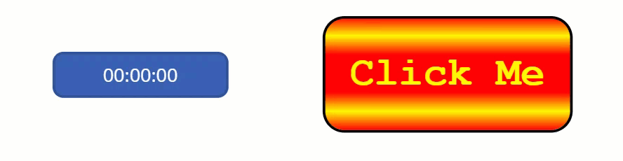
Run the app and manually start the timer and the result is shown below
Now it can be seen why we wanted the value of varGreenSlider to have a minimum value of 127, it’s to ensure that the Yellow text and 2nd and 6th tier never completely disappear from view
To have the button animation run when the page is loaded, set a Boolean variable to be true via the OnVisible property of the screen and use this variable to start the timer via the timer’s Start property. The timer will stop automatically if you navigate away from the page and on returning to the page the OnVisible Boolean variable will start the timer again
Don’t forget, HTML Text boxes have Height, Width, X & Y properties just like any other control so you can make them fully responsive
As with the other CSS buttons I’ve demonstrated on earlier posts, there is enormous scope to build custom buttons through changing the colors, timer duration or using multiple variables. The only limit is your imagination!
Further Resources
Hiredgun.tech: Beautiful Buttons with CSS
Hiredgun.tech: Color Animated Buttons
Hiredgun.tech: Button Rotation Animation with CSS
Also, checkout these sites for ideas on cool looking CSS gradients and to find out more about CSS and its background-gradient property:
https://cssgradient.io/
https://webgradients.com/
https://www.w3schools.com/cssref/func_linear-gradient.asp