In the post: Beautiful Buttons with CSS, we created some really cool looking Power Apps buttons using a HTML text box and inline CSS. Now we are going to take it to the next level and created animated Power Apps buttons!
Button Animation
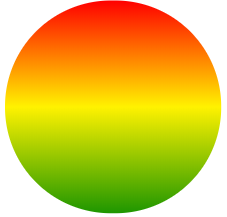
First of all create a circular object by inserting a HTML text box and adding the HTML & inline CSS below. If you want more details on how the CSS works then see my earlier post ‘Beautiful Buttons with CSS’
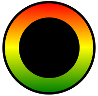
Now add a timer and set the duration to 50 (a twentieth of a second). OnTimerStart (or OnTimerEnd – it doesn’t matter), add the following text so the value of varRotation increments by 10 every time the timer completes a cycle
We use a Context variable rather than a Global variable as the button will only be viewed on this screen. Also if we navigate away from the page the timer stops and only restarts when we return, so this has the advantage of minimising the load on system resources
UpdateContext({varRotation:varRotation + 10});
Now add the following text to the OnVisible property of the screen so every time the screen loads the object is in the same traffic light position with red at the top and green at the bottom
UpdateContext({varRotation:0});
Run the app manually start the timer to see the effect on screen. Pretty cool huh? But we aren’t finished just yet
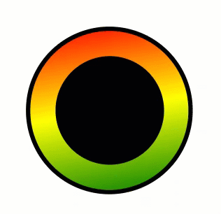
Create a circle icon that is about two thirds the size of the existing object with a solid black fill. Place it so the two circles are centered over the same point. Now create a button that is exactly the same size as the HTML text box (we covered how to do this in my earlier post: ‘Beautiful Buttons with CSS’). Make sure the Fill of the button is set to transparent and give it a black border
Now create a variable that will be used to start the timer and set the value to true on the OnVisible property of the screen. Set the Start property of the timer to the same variable so the timer starts immediately the screen loads. Also set the HoverFill for the new created button to PaleGreen with 50% transparency using the RGBA code RGBA(144,238,144,0.5)
Don’t forget, HTML Text boxes have Height, Width, X & Y properties just like any other control so you can make them fully responsive
That’s it, all done, on launching the screen you will see the following. Put on your sunglasses on and enjoy!