In this post I’ll demonstrate how to dynamically change the colors of a Power Apps control to create some striking dayglo effects! This is straightforward to achieve with the help of a timer control and high school maths!
Below are the RGBA values for the colors Red and Yellow where RGBA stands for Red, Green Blue, Alpha and the subsequent parameters are their respective values. You will have seen RGBA used in Power Apps color related properties
RGBA for RED:    RGB(255, 0,   0, 1)
RGBA for YELLOW: RGB(255, 255, 0, 1)
You can see that both the Red and the Blue values are the same for both colors, the only difference is the value for Green. Alpha defines the color’s transparency, 1 is solid and 0 is fully transparent
Incidently, every color has a unique combination of the 3 RGB values, each of which are between 0 and 255. This means that there are 256^3 colors available to use, ie 16,777,216 in total
Changing Colors with a Timer
If we have a way to change the Green value from 0 to 255 then we can dynamically change the color from Red to Yellow. Well, there just happens to be a great way in Power Apps to change the value of a variable using a timer control. We will combine this approach with the placing of a variable within the RGBA Fill property of the button or shape
Here’s how to do it…
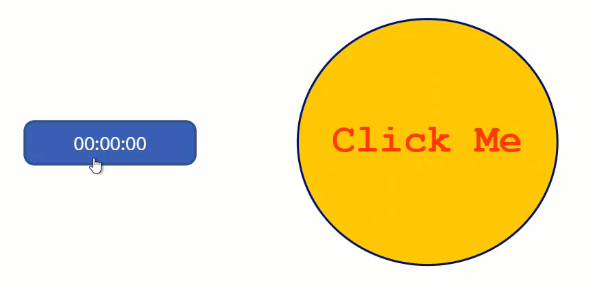
Insert a timer control on to the screen and set the Duration property to 1000 (1 second)
Set the Repeat property to true
Set the OnEnd property to UpdateContext({boolGreen:!boolGreen})
Now create a button (or a shape with a Fill property) and set its Fill property to:
RGBA(255,If(boolGreen,0,255),0,1)
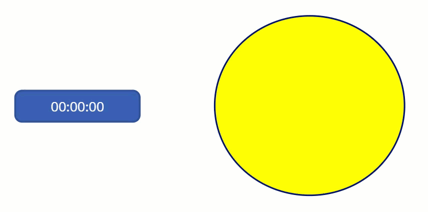
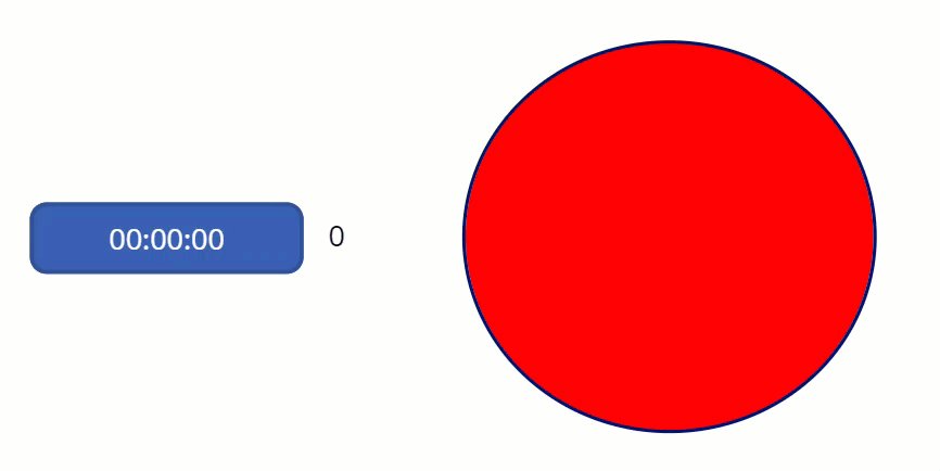
Now run the app and start the timer by clicking on it:
This works by the variable varGreen initially having a default value of false (this doesn’t need to be assigned anywhere, though you could do so if you wanted to make true the default value). Therefore for the first second after the timer starts to run, the value of varGreen remains false and 255 is assigned through the If statement in the Fill property If(boolGreen,0,255) . The initial color of the circle is therefore Yellow. At the end of every one second cycle, the value of varGreen is flipped to the opposite value via the Not operator (denoted by !) in the OnEnd property of the timer: UpdateContext({boolGreen:!boolGreen}). Consequently, at the end of the first second the value of boolGreen changes to true and the output of the If statement flips to 0. The color of the circle immediately changes to Red, and the sequence repeats as long as the timer runs
Now that’s pretty good so far, but we can exert even greater control on the color than a simple Boolean true/false by applying some maths
First lets insert another timer control and set the Duration property to 50 (which is a twentieth of a second) and set the Repeat property to be true. Also set the initial value of a new variable varCounter to be zero by adding the following to the OnSelect property of the timer UpdateContext({varCounter:0})
Now assign the following to the OnEnd property of the timer
Now create another shape (or copy the existing shape we used earlier) and set its fill property to RGBA(255,varGreen,0,1)
Run the app, start the timer and see the result!
The value that you see in the label at the side of the timer is that calculated by the second line above and applied to the varGreen variable and subsequently the Green/G value of the Fill color of the circle. As you can see it alternates between 0 and 255 so changing the color from Yellow to Red as the timer increments the value of the variable varCounter
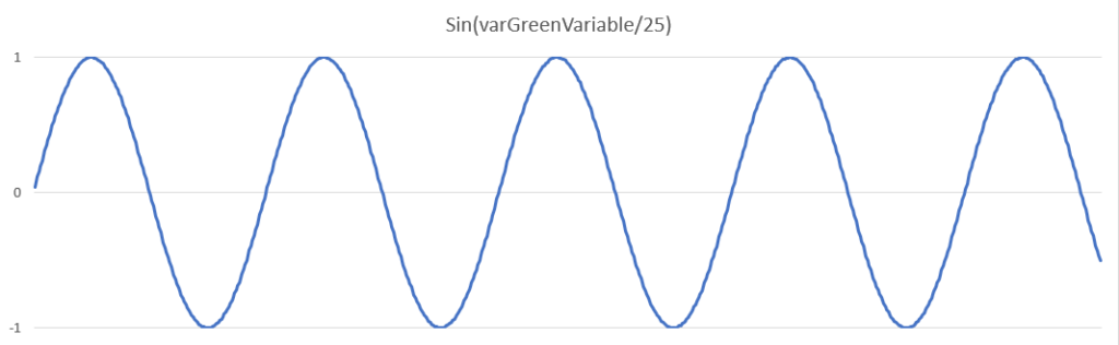
The Sine Function
Here’s how the formula works
The Sin (Sine) formula calculates the radian equivalent of its subject value and always returns a value between -1 and 1. Below is the graph of the output for Sin(varCounter/25)
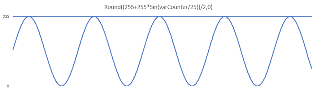
Now the shape of the graph is perfect for our purposes as we want the peaks and troughs to be rounded to emphasise the Red and Yellow but we need to convert the peak value to 255 and the trough to 0
Having taken the Sin of varCounter/25, we multiply by 255 to give a max value of 255 and a min of -255. Then we add 255 and divide by 2 giving our desired output of a max of 255 and a min of 0. Finally we use the Round formula to remove any decimal places
The output is a smooth flow (much smoother in actual Power Apps than represented in the above GIF) starting with 0 rising to a peak of 255 before falling back to 0 again, and the process continues indefinately
As a final flourish, apply a label or button over the circle and make the Fill and BorderColor transparent. Assign the Color property to be initially the same value as the circle but then subtract the variable from 255 as shown below
RGBA(255,255-varGreenVariable,0,1)
Run the app, start the timer and see the results. You’ve got to love it!
The Magenta button uses the slightly amended forumla below so the varGreen alternates between a minimum of 50 and a maximum of 200. This is because I don’t want the button to turn completely white or speed too long in deep magenta
RGBA for MAGENTA: RGB(255, 0,   255, 1)
RGBA for WHITE:   RGB(255, 255, 255, 1)
Clearly there is great scope to flex the design of the buttons through changing the color options, changing the timer duration, even using multiple variables. Other trigonometrical formulas could also be used to give a different emphasis
Automation on Screen Load
To have the button animation run automatically when the page is loaded, set a Boolean variable to be true via the OnVisible property of the screen and use this variable to start the timer via the timer’s Start property. The timer will stop automatically if you navigate away from the page (preserving system resources) and on returning to the page the OnVisible Boolean variable will start the timer again
Also set the initial value of a variable varCounter to be zero by adding the following to the OnVisible property of the screen UpdateContext({varCounter:0}). This will reset everyime the screen is loaded
Don’t forget, HTML Text boxes have Height, Width, X & Y properties just like any other control so you can make them fully responsive