CSS is a great way to create graphics and cool effects in a Canvas App. CSS is powerful, flexible and often avoids the complexity of creating a PCF code component
With CSS you can visually do pretty much anything and it’s my favourite tool to extend canvas apps and create graphics
CSS Canvas App Graphics
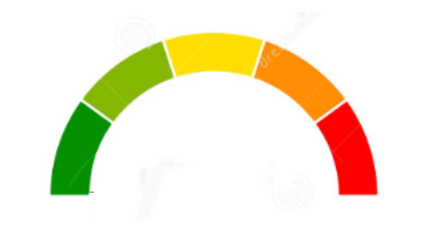
As the saying goes, a picture speaks a thousand words. A great example of this is the graphic below of a rotary dial

This graphic cannot be created just using the icons or shapes available within canvas apps but can be easily created with the help of CSS
CSS is entered within a HTML Text box. The CSS is ‘inline’ meaning it must be within the HTML text box itself. It’s not possible to link to an external CSS file as is usual with web development. The CSS doesn’t need to be all hard-coded. Canvas app variables can be inserted into the CSS as I will demonstrate
Creating a Rotary Dial
The rotary dial consists of just 3 controls

The first of these is simply the image below used as the backdrop for the rotary dial. As with all images, it is uploaded to the app and displayed in an Image control

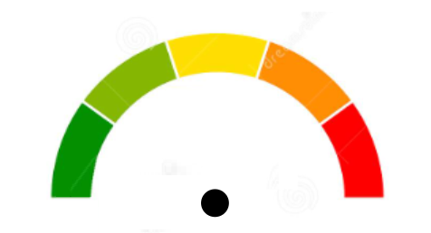
The second control is a circle Icon to act as the central axis of the needle. It’s just a black circle with a white border

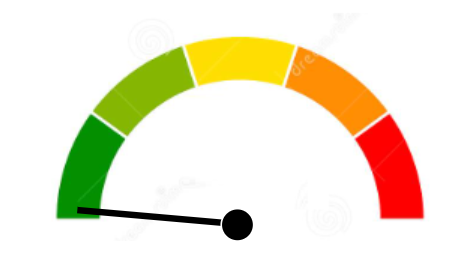
The third component is the needle. Because I want to create the visual of the needle rotating, I create it using CSS
The code below is entered in a HTML Text box and I’ll explain it line by line
"<div style='
   height:200px;width:4px;
   background: linear-gradient(black 50%, transparent 50%);
   transform: rotate(" & sldDial.Value & "deg);
   position: relative;
   top: 50px; left: 140px;
'>
</div>"
The ‘height’ paremeter creates the needle shape of dimension 200 pixels by 4 pixels
The ‘background’ parameter creates a linear-gradient(black 50%, transparent 50%). This defines the background color of the needle shape. Linear-gradient is a really useful CSS property that has many uses in canvas apps. Here I’m using it to color the needle black for its upper half and transparent for it’s lower half. The reason for this will become apparent shortly
The ‘transform’ parameter uses the transform: rotate property to rotate the shape depending on the value of a Slider control called sldDial. The Value of the Slider control is injected into the CSS using concatenation
The ‘position’ and ‘top’ parameters define where the needle is positioned within the HTML Text box
Completing the Dial
When the 3 controls are aligned the dial is created. It is as simple as that. I’m using a Slider as the input for demo purposes, but in an app it is more likely that a variable would be used. The max and min values for the dial can applied to the CSS as required
It’s that straightforward to create cool canvas app CSS graphics!
CSS Transform Property
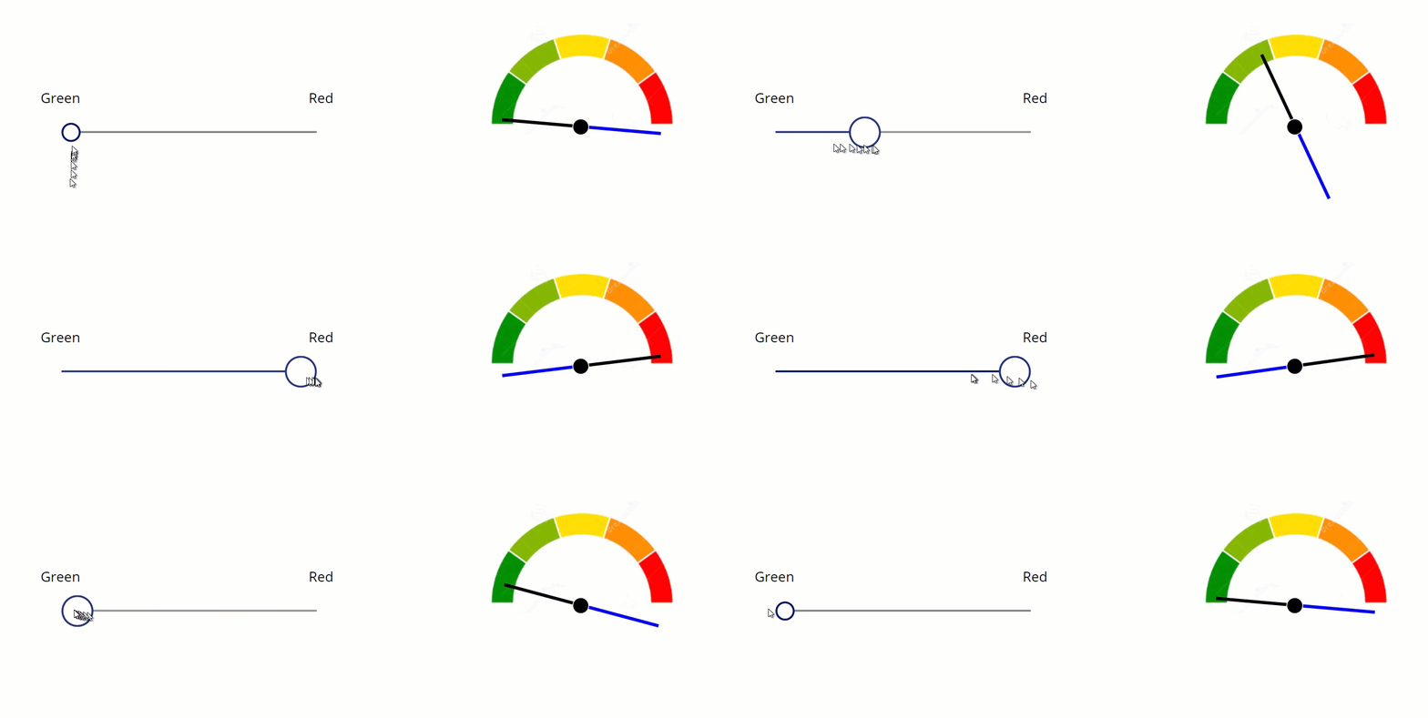
Before signing off, let me explain why I want only half of the needle to be visible. When the CSS transform: rotate property is used, the rotation is around the shape’s central axis, ie it’s middle. Because of that, we only want the top half of the needle to be visible
If I temporarily change the color of the lower half of the needle to blue instead of transparent, you’ll see what is actually happening

Because of this, it’s important that the size of the HTML Input box containing the CSS is large enough to contain the full needle including the half that is not visible. If it’s not large enough then scroll bars will appear and that’s not what we want
Other Ways to Use CSS in Canvas Apps
Not all the CSS properties work seamlessly with a canvas app and that can be a little frustrating. However, CSS is very rich and flexible so it’s usually possible to find alternative ways to create the desired effect
Below are links to some of my posts a couple of years ago where I’ve used CSS and the transform: rotate property to create some striking visual effects
Hiredgun.tech: Beautiful Buttons with CSS
Hiredgun.tech: Color Animated Buttons
Hiredgun.tech: Button Rotation Animation with CSS
I just found your blog and I absolutely love the content you’re covering. I rarely find content these days that speaks to topics I have an interest in within the Power Platform. Your approach to nuggets of information on everything from this like this post to the fundamentals is great to find. I’m familiar with a lot of what you’re covering but still gleaning things here and there while also picking up entirely new concepts.
We have restrictions on various things like PCF and image access so this might be something I end up using. Modern controls are great in a lot of ways but there are still some quirks and sometimes I just need more access to reliable properties.
I haven’t gone through everything but have you considered writing up anything on xpath? I’ve used it a little with amazing results but if I’m being honest, it’s still somewhat mysterious to me.
Thanks Andy, I’m pleased you are finding the content useful and and interesting